Responsive Garden
This collection of responsive modules serves as a place where I can add more as time goes on. Each page has two different versions of the same module - that becomes populated with data that is unique to the pages with styles that are based on the page the module is on.
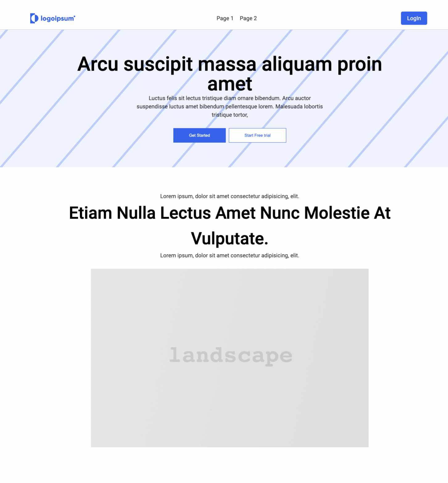
An example of three modules that are unique to the first page. This is a living project where new modules can be added as time goes on. I always operate on a mobile-first basis.
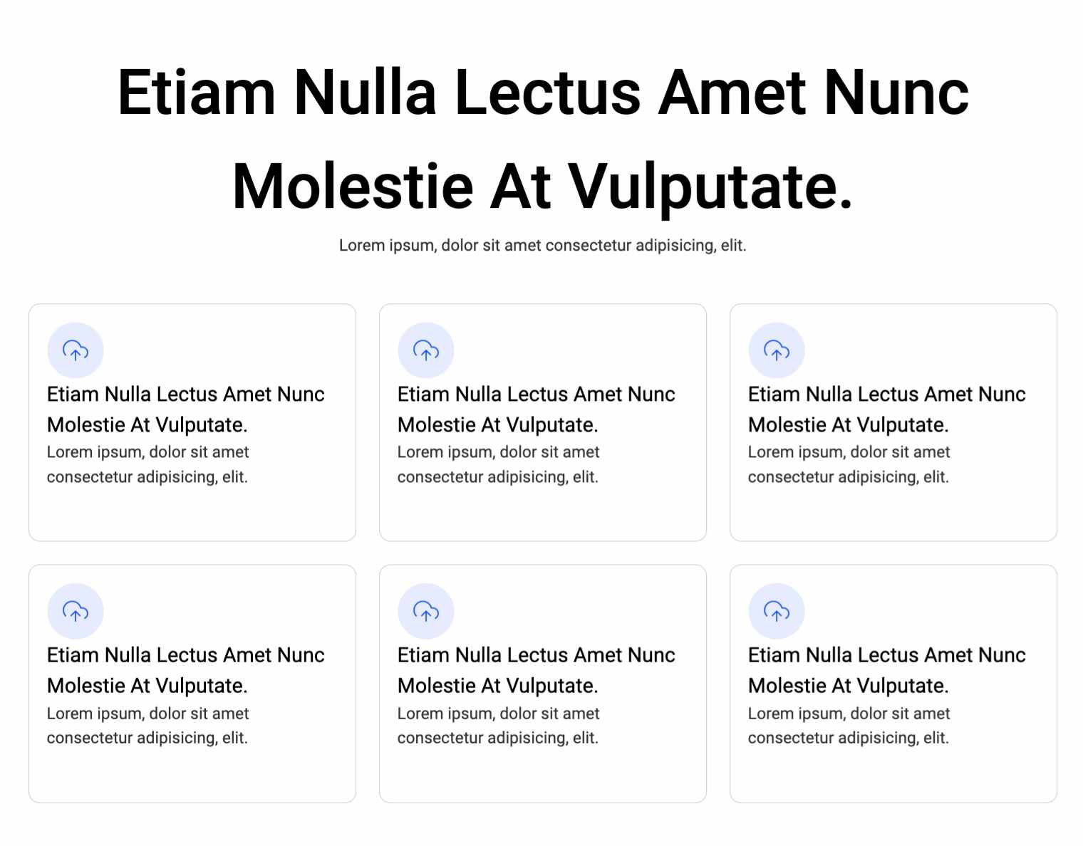
This article grid uses the same HTML as page 1's article grid, but has different styles based on the value of the page in JSON.
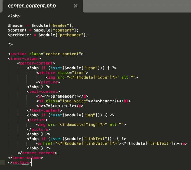
An example of one such module, with variables linked to JSON at the top. That JSON then populates the module's HTML.
This project taught me a lot about scope and planning. I learned that I could tie CSS rules to the JSON as well, and that allows me to set unique CSS depending on the page. I used grid extensively on this project and that proved to be extremely useful! Splitting the page into separate modules allowed me to use JSON to give them distinct text and CSS.
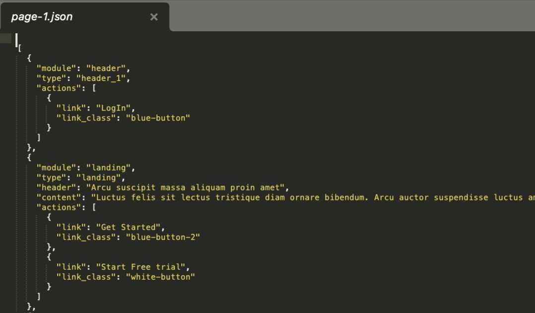
An example of JSON for two modules that populates templates like the one seen above.
This collection of responsive modules serves as a place where I can add more as time goes on. Each page has two different versions of the same module - that becomes populated with data that is unique to the pages with styles that are based on the page the module is on.
An example of three modules that are unique to the first page. This is a living project where new modules can be added as time goes on. I always operate on a mobile-first basis.
This article grid uses the same HTML as page 1's article grid, but has different styles based on the value of the page in JSON.
An example of one such module, with variables linked to JSON at the top. That JSON then populates the module's HTML.
This project taught me a lot about scope and planning. I learned that I could tie CSS rules to the JSON as well, and that allows me to set unique CSS depending on the page. I used grid extensively on this project and that proved to be extremely useful! Splitting the page into separate modules allowed me to use JSON to give them distinct text and CSS.
An example of JSON for two modules that populates templates like the one seen above.