Riche Fashion
The primary inspiration for this project came from Gucci and Prada.
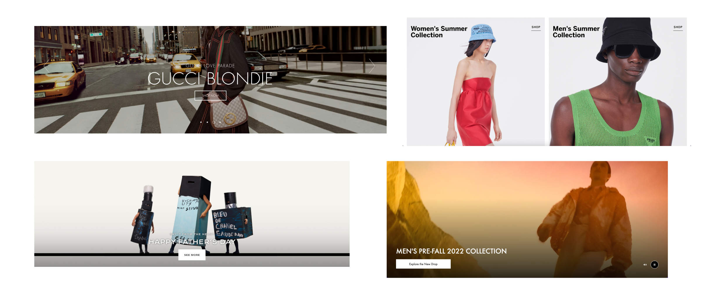
The first stage of this project came from researching different high-end fashion companies. I took a few examples of modules or cards to lead my design process for the landing page.
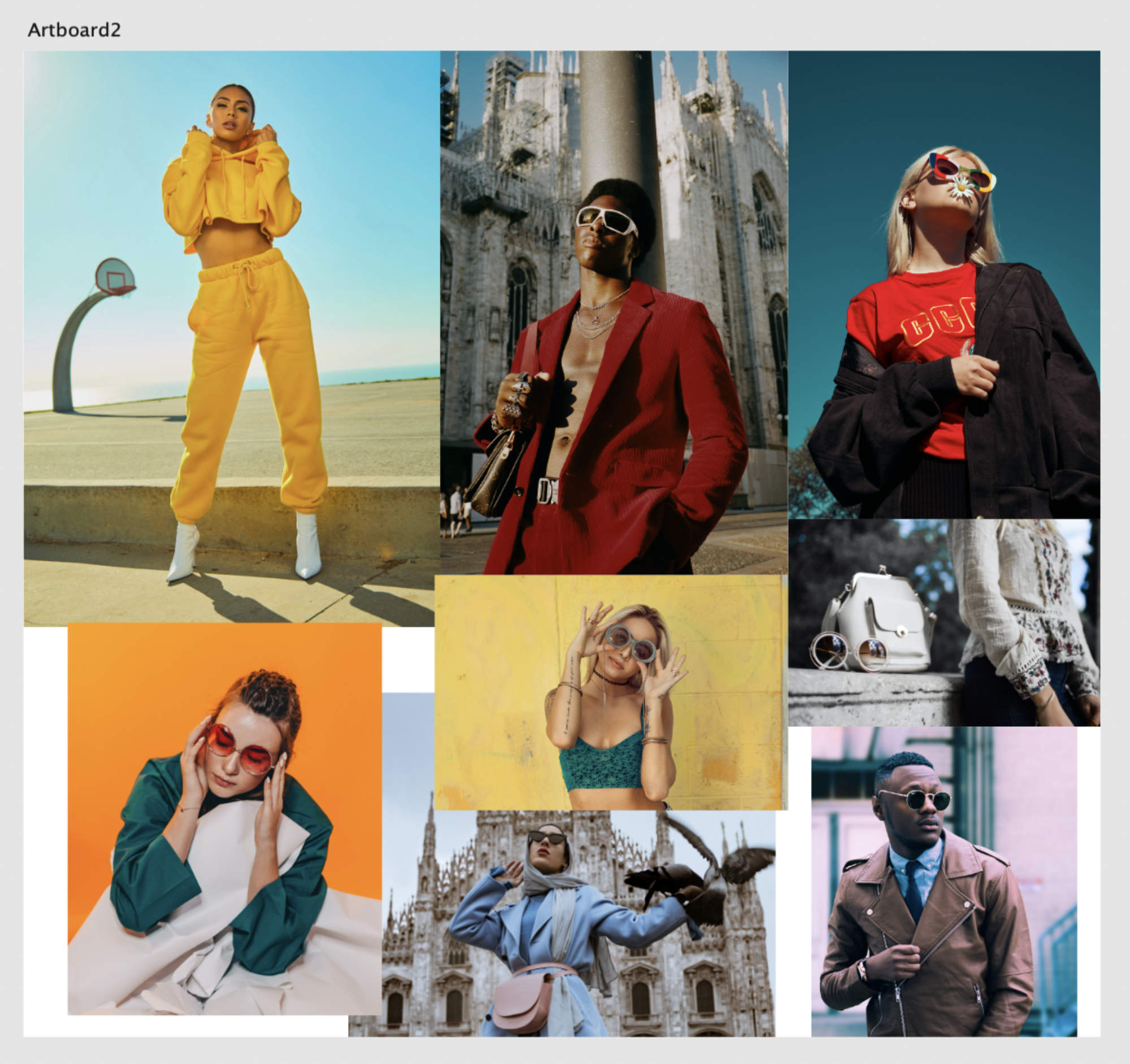
I got these images from Unslpash.com, and I keep a folder of images like this just in case I need them to design a card around.
Modules need content! Just like with Croatian Coasts, I keep images like this in storage to pull out when needed, and what I don't have I get from free resources like Unsplash.com
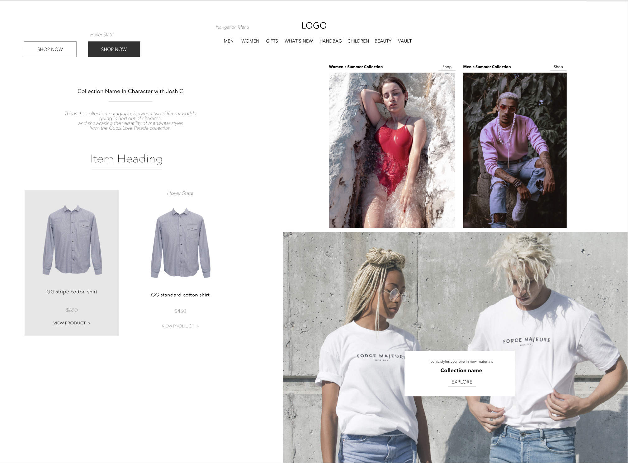
This is an example of a style tile. This serves as the foundation for the design moving forward. Cheap and effective solutions like this allow us to get user feedback quicker, instead of having to spend time creating a fully fleshed mockup to start.
I created a style tile like this to organize the module designs, typography choices, and color and spacing ideas. As more modules get made, I can add those designs to the ones seen here.
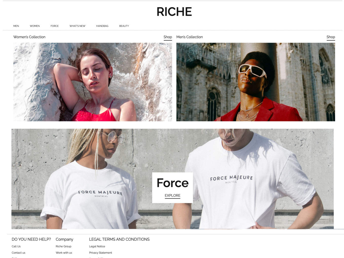
The landing page is very similar to the sites that inspired it. Compared to the original modules seen from Gucci and Prada, this gives a monocolored spin on the large blocky font and images to accentuate the models and clothing.
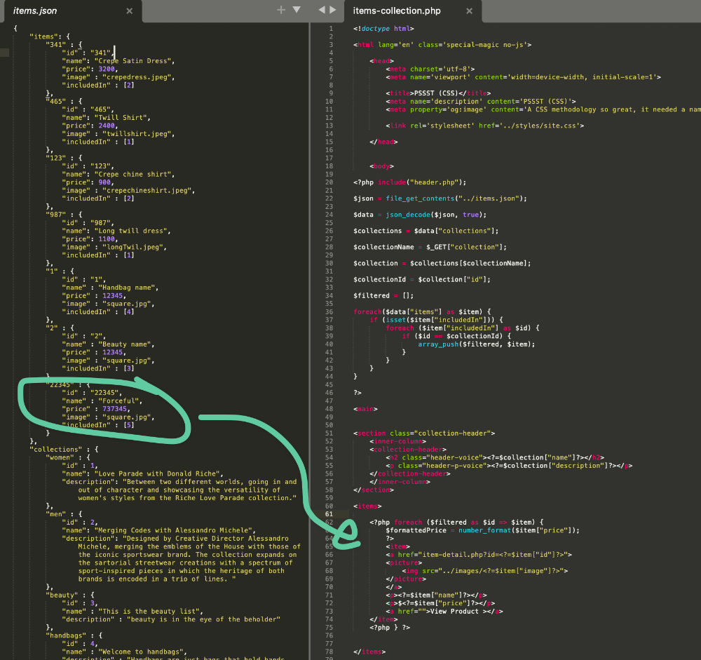
Once the items are compared, they are pushed into the new filtered array.
A quick example of item filtering. I check the value of what collection the item is included in and compare it to the collection number. This project was a great exercise in designing a high-end fashion site. Some of the hardest problems were figuring out the filtering and choosing what content would be best. I may add more items or functionality in the future!
The primary inspiration for this project came from Gucci and Prada.
The first stage of this project came from researching different high-end fashion companies. I took a few examples of modules or cards to lead my design process for the landing page.
I got these images from Unslpash.com, and I keep a folder of images like this just in case I need them to design a card around.
Modules need content! Just like with Croatian Coasts, I keep images like this in storage to pull out when needed, and what I don't have I get from free resources like Unsplash.com
This is an example of a style tile. This serves as the foundation for the design moving forward. Cheap and effective solutions like this allow us to get user feedback quicker, instead of having to spend time creating a fully fleshed mockup to start.
I created a style tile like this to organize the module designs, typography choices, and color and spacing ideas. As more modules get made, I can add those designs to the ones seen here.
The landing page is very similar to the sites that inspired it. Compared to the original modules seen from Gucci and Prada, this gives a monocolored spin on the large blocky font and images to accentuate the models and clothing.
Once the items are compared, they are pushed into the new filtered array.
A quick example of item filtering. I check the value of what collection the item is included in and compare it to the collection number. This project was a great exercise in designing a high-end fashion site. Some of the hardest problems were figuring out the filtering and choosing what content would be best. I may add more items or functionality in the future!